Evaluation Question 4

06:00:00 0 Comments

Audio:


https://youtu.be/pojxpjANx7o


Transcript:


The use of media and digital technology was essential to all stages of our progress in creating our music video.
In the planning stages being able to easily contact each other via our phones and social media, made organising filming schedules and delegating tasks much quicker than if we had to arrange everything in class. Social media was also integral in contacting cast. We were able to research the actors we initially wanted to use from Sandra Reynolds, and later, contacting the actors we used from our school. It also gave us a platform to promote our music video, update people on its progress, and market the final product.


Being easy access to the internet was integral to finding appropriate locations. When we first were looking for an abandoned building, and were hoping to film in the Pontins in Hemsby, it was vital we could assess the area in order to plan for shots, and made finding a bask-up location still in Hemsby easy. It also enabled us to find the eventual abandoned building in an area very close to us. We also used the internet to find the actors from Sandra Reynolds which, whilst they weren’t used, gave us a clear vision for who we wanted to cast in our video. YouTube greatly aided us too, in seeing examples of both student and professionally made music videos, and finding tutorials in order to better our editing skills and help inspire our ancillary tasks.
We used technology in the construction of our music video with the use of a shared google calendar in order to organise our filming schedule, and, again, the aiding of editing with tutorials and inspiration. We also used it for the promotion of our video and, of course, the camera used to film our video, which was the Nikon D3300 DSLR. And, in contribution, the planning and research sections of our blog aided the ease of construction of our music video.


In order to edit our music video we used Adobe Premier Pro, using the afore mentioned tutorials to not just cut our scenes together but utilise the effects available to our best advantage. However, some of the effects we desired were too advanced, and so, for which, we used Adobe After effects to, for instance, create the majority of the glitches as seen throughout our video. We also used the uploading of our rough cut to YouTube to help our editing process as we could target our alterations at the negative comments from our audience feedback in class from it.
Due to the promotion of our video on social media and the uploading of it on to YouTube we were able to gather audience feedback with ease, thereby enabling a more informed evaluation, which we have again posted on our blogs.

In conclusion, we have used media and digital technology in order to gather information from a wide variety of sources and to plan for all eventualities, making our filming process well organised for. And in order to film and edit our music video, and gather valuable evaluative points for it.

0 comments:

Evaluation Question 3

05:00:00 0 Comments

Vlog:

https://youtu.be/BGrhhkcEWfw

0 comments:

Evaluation Question 2

14:40:00 0 Comments

How effective is the combination of your main product and ancillary texts?


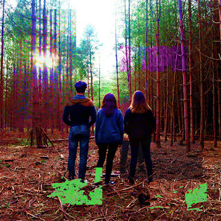
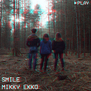
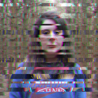
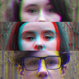
Both our main products and ancillary texts have clear links, starting with the glitch theme. In both the main video and the digipak, the glitch theme is clear throughout both. Starting with the main product, the glitches continue to get worse throughout the video. It starts with small glitches such a mirroring and pixel distortion, but they soon get worse in time with the beat later in the video. Similarly with the ancillary, the images are distorted using Photoshop, either by the hues or pixel manipulation, seen more in the inside pocket. Arguably this isn't seen as a popular choice throughout conventions, but we feel we conformed and went against stereotypes when choosing an artistic theme.

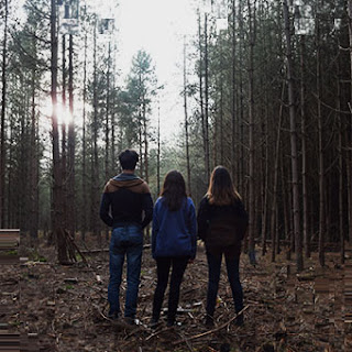
Featured on our digipak is our main characters, all facing away on the front cover, and then looking towards the camera. We felt this was appropriate for the cover as it links to our main video, and gives a recognisable connection between the two products. This goes against conventions as most artists (including Mikky Ekko himself) use themselves on the front covers, selling themselves as a promotional element for there products. Clearly we don't have the singer on the front cover (also because our video is purely narrative, no 'band shots') so we felt it was appropriate to have our actors instead, to make the connection clear between the two products.

Adding to this, 'Smile' itself fits with both products, and helps them both in combination. The genre is Alternative, and the lyrics of 'smile the worst is yet to come' fits perfectly with our dystopian theme, once the group are reunited the worst is hinted to come, as the guards chase towards them during the cliff hanger. With this we feel we went against conforms as most videos don't fit with the set lyrics, and also the intended meaning behind them. Again with the digipak, the apocalyptic theme is clear throughout, with both the settings used in the original video and the characters.

Linking to the settings, it's clear there is an intended link between the two. The settings used in the original video are also part of the digipak. We wanted to do this because it gave a clear link between the two, and also gave a good background for the track list on the digipak.

Regarding our poster, it uses the main image from our digipak, along with the titles and reviews from online music review sites. We felt this was appropriate to link between the digipak and the actual video, still remaining with the theme of glitches and the trio as the centre point. We conformed to conventions as we used the same image as the album art, which most artists use for continuity, but also once again went against by using our actors instead of a lead singer/band.

Finally looking at our digipak, we decided to go down a more atheistic look than promotional. We valued our images and theme more than text about promotion (e.g. 'featuring the hit single') and only included the copyright details and barcode on the back with the track list. This goes against conventions as most digipaks include these promotional messages, in aid to sell more if a single is featured on the album.

In conclusion we feel that both our products work in combination to each other, and compliment each other on the theme of our narrative along with the song choice and digipak art. If anything we could of improved on the inside cover of our ancillary, adding a blurb about the narrative of the video to make it clearer, but overall they compliment each other well and have clear links between them both.

0 comments:

Evaluation Question 1

15:50:00 0 Comments


Whilst the use of a linear narrative was previously much more of a convention than other structures of narrative, we now more commonly see non-linear narratives in media, with inspiration from films such as Rashamon (which we ourselves were influenced by) and a need for more originality in a time where unused storylines are few and far between. We used the non-linear structure to give more depth to our characters and plot as, by allowing us to skip to different periods of time in their story, we were able to cover all aspects we wanted to cover within the timeframe of the song. We were also able to fit the different elements of the narrative to the different sections of the song.


Dystopias are defined as futuristic, imagined universes in which oppressive societal control and the illusion of a perfect society are maintained through corporate, bureaucratic, technological, moral, or totalitarian control. We decided to develop on the conventions of the dystopian genre by taking the commonly broken down and advanced nature of dystopian societies and conveying it literally in the glitches we used. The glitches get increasingly noticeable as the story deteriorates, acting demonstratively of their degenerating situation. They provide a building of tension and make the pauses in such much more poignant and impactful. This develops on the dystopian convention of the general population being powerless against whatever the oppressing force may be, as it highlights a time in our characters' lives that shows them as being quite innocent and naïve, therefore implying their vulnerability.


A convention of media we challenged in our music video was that of gender stereotypes, and we did so through our casting and characterisation. It is all too common in media for there to be a gender divide whereby men play the stronger and higher status characters, whereas women play the less influential or independent characters. We decided very early on we wanted to challenge this. We decided there should be three characters: a leader, an intelligent character, and a strong willed character. We wanted the intelligent character to be a male role, as we wanted to construct a character valued for something other than hierarchy, which greatly influenced our casting of Charlie as we wanted to demonstrate that having physical strength does not correlate with lacking a multi-faceted personality, an unrealistic character type that we unfortunately see regularly in the media. We then wanted the leader and strong willed characters to be female roles as we wanted to show women in a position of power, and have the roles so well adopted it would be unquestioned and unthought of.


0 comments:

Audience Feedback

16:22:00 0 Comments


0 comments:

Final Cut

06:20:00 0 Comments

https://youtu.be/8BLY7YOFff4

0 comments:

Rough Cut

06:20:00 0 Comments

https://www.youtube.com/watch?v=VyNkwssJlSA

0 comments:

Final Ancillery Products

14:28:00 0 Comments

FRONT


BACK


INSIDE


CD 


ALBUM LAYOUT


POSTER

0 comments:

Construction of the Ancillery Task

14:26:00 0 Comments

Below are all of our mock ups made on Photoshop for our digipak. Beginning this stage we knew we wanted to continue the theme of glitches with our ancillary task, giving it continuity throughout both products. I played around with different effects in Photoshop, including the adjustments and changing the hues and moving them across on a new layer. Later in the experiments I added in the VHS text to give it a retro feel, but also adding to the glitches more. Overall we learnt we wanted to continue the slanted colour hues and text, along with the pixel distortion.


0 comments:

Ancillery Research

14:25:00 0 Comments

In preparation to create our digipak, we needed to research various examples to both inspire us and also see what conventions  are used in this market. Firstly it made sense to look at our song's digipak, Smile by Mikky Ekko, to set an example.


Seen above is the 'Smile' single's front cover, along with the album it was taken of, 'Time'. Ekko sticks with a similar theme throughout both these digipaks, using his face as a centre point along with the title's in clear writing, contrasting between himself and the backdrop for the image. These both stick to conventions of a typical solo artists cover, using their face as a key aspect of their image, making their brand more recognisable.

Our second example we looked at was the second song we had on our list to create a music video with, Gravel to Tempo by Hayley Kiyoko. We felt it was appropriate to look at her digipak examples as the song was a close choice.


With Kiyoko's covers, it's more about the aesthetic elements than her using herself to brand her music. Unlike Ekko's, Kyoko uses various colours, tones and artistic interpretations in her work. Firstly with her latest album 'Citrine', the cover is simply a landscape with a pool, and the title. This works visually and to promote the album, as the yellow/orange colour scheme fits with the title, and attracts the viewer to the title. Secondly with 'This Side of Paradise' the artistic collage of the individual fits with the black border, drawing the audience to look at the art and then the name and title of the album and artist. 

Finally another contender was 'This is Gospel' by Panic! at the Disco, so once again we felt this was appropriate to look at their previous digipaks. 


With both of these covers, the main singer is present. Again this adds to the market value of the single, making the lead singer a key part of the bands selling point. The first cover uses a monotone effect, colour selecting the smoke as a key area of the cover. The title is also clear to see up top, and despite it being longer than most albums, it fits perfectly with the proportions of the album. The second cover has a more aesthetic tone, using the line art to set the tone of the album, and the bands changing image. The titles here are a little harder to see, but still do a great job of marketing the album. 

0 comments: